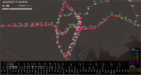
A screen showing the train congestion visualization system in-terface. The numerous triangular icons represent trains en route, and the color and size of the icons show delays or congestion for the respective train.
©JR東日本
Text by Reiko Imamura

The East Japan Railway consists of 69 lines, with 12,296 trains carrying a total of 17.8 million passengers daily. The Tokyo metropolitan area comprises the majority of these lines, where congestion and delays are a daily affair and for which measures have been taken, like increasing the number of trains or train cars during rush hour. Under these circumstances, in 2014, research began on using data to visualize congestion for command centers.
In JR East’s command centers, command personnel have respective routes they have been tasked with managing. If, for example, a disruption such as an injury occurs, trains will stop immediately. Passengers must wait in the meantime and congestion increases even once the operations resume, which results in further delays. The objective of command personnel is to return operations to the timetable. They communicate with station personnel and crew to keep trains distributed evenly across the timetable and provide instructions for returning trains. This is like solving a complex puzzle by leveraging knowledge and experience gained on site. The idea brought up here was to incorporate ICT on-site to support operational management based on quantitative data rather than experience and intuition.
The system uses two types of data: train delays and congestion. With both data overlaid on a screen, one can get a bird’s-eye view of transports in the Tokyo metropolitan area and understand where delays and congestion are occurring, which allows for a quick return to the timetable with an eye on overall optimization.
The train congestion visualization system went into service in April 2017 and was lauded with a Good Design Award the following year for its “enthrallingly beautiful GUI.” At Hitachi, we have so far placed our focus on data visualization technology for transportation facilities such as railways and buses, but this time we went for something that on-site command personnel would find intuitively easy to follow.
On screen, innumerable small triangular icons move along the Tokyo metropolitan area’s 24 train routes consolidated on a map. Train delays are represented by the color of the triangles— red, for example, indicates an increasing delay. Congestion is shown in the color and size of a circle surrounding the triangle. Severe congestion would be depicted by a large, red circle.
With brightly lit dots moving across a black background, viewers can pick out easily where there’s congestion on a train route.
Three years after the system went into operation, past data on congestion is used not only for managing daily operations but also for irregular measures, like repairs that may take several days.
For future development, analyzing past data on congestion to root out the cause of chronic congestion or even predicting congestion would be the next research topic.
Meanwhile, efforts are also underway to inform users of congestion as a countermeasure for the COVID-19 pandemic. A system that predicts congestion at train stations is in its trial phase on the Yamanote Line. JR East and Hitachi will soldier on to mitigate congestion and relieve themselves and their passengers of this bane.